Complex, made clear.
Making complex public information clear, accurate, and usable.
Most studios do one of these things. We do an unusual combination, and we do it to a professional standard: information design and data visualisation at the centre of our practice, with genuine depth in publishing, brand and identity systems, web development, and print production around it. That combination is what lets us take a royal commission from its logo through to a 100,000-word report, or take a client's raw data through to an interactive dashboard — without handing off between three agencies and losing coherence along the way.
A small number of significant projects — royal commissions, tribunals, and organisations that deal in complex, high-stakes information. In each, the same discipline: data and findings made clear without losing their authority.
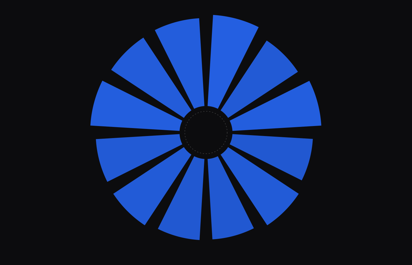
Sixteen years of crime in South Australia
1.78 million reported offences become a guided story, then an instrument — any of 2,295 suburbs, down to the raw table.
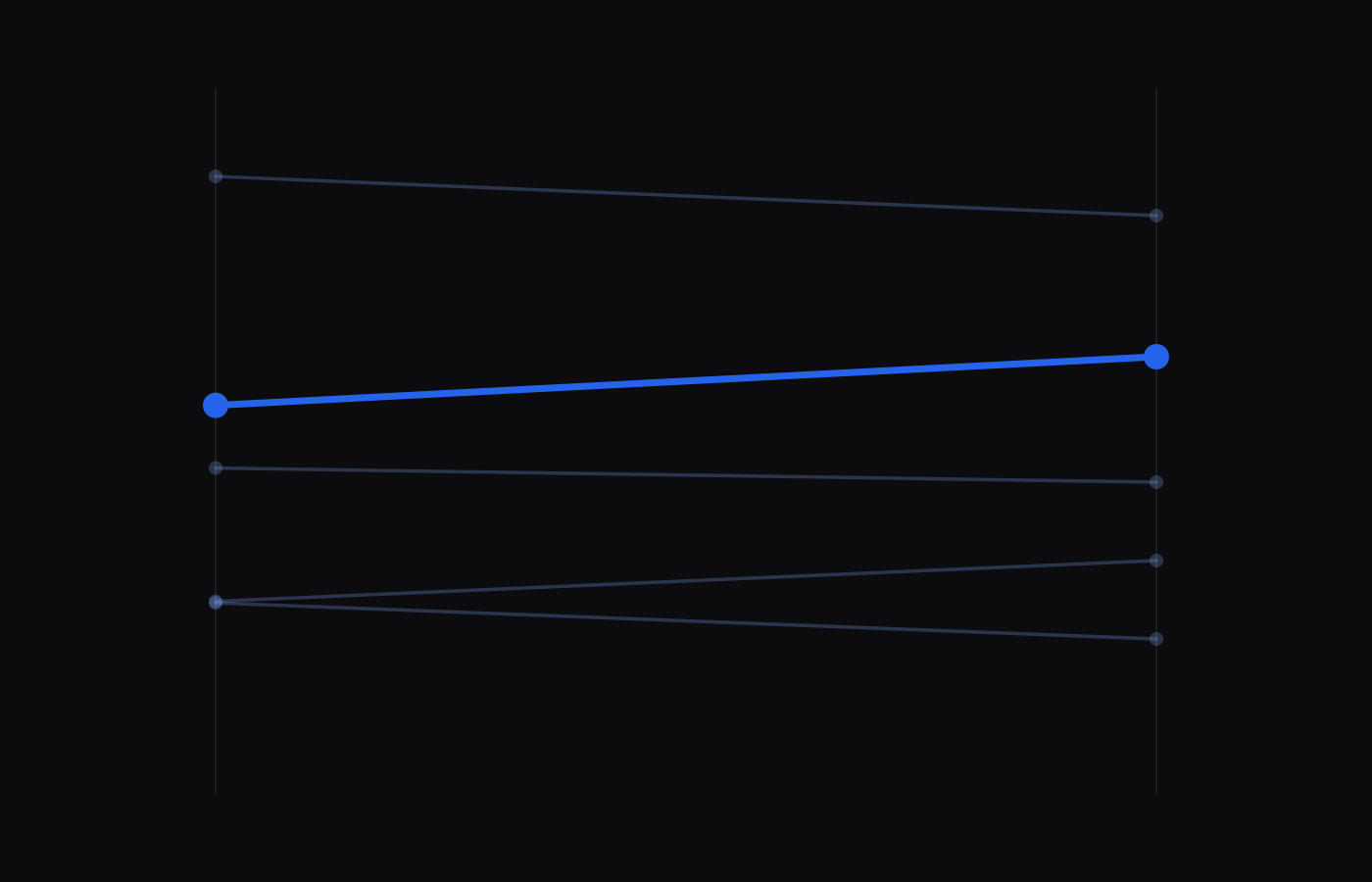
The second force
The June poll, told as it happened — for Ace Strategies.
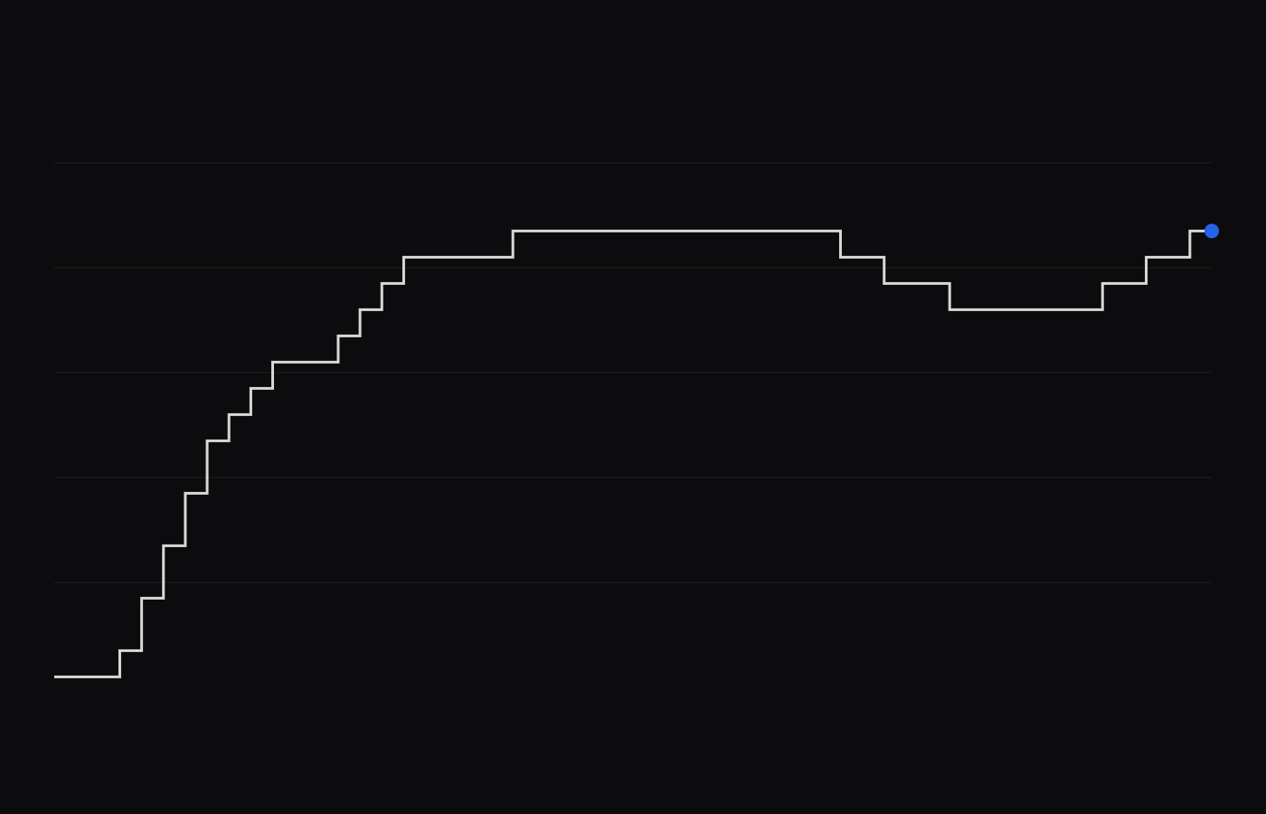
The economy, in data
Rates, prices and work — every figure traceable to a named release.
South Australia, live in data
Single-file artefacts, fonts embedded, WCAG 2.1 AA enforced at compile. Your data never leaves your machine.
Your data deserves this.
A report worth reading twice starts with one email.
A studio for
information design.
We are a boutique communications and design studio in Adelaide. Our work sits at one point: making complex information clear, accurate, and usable — whether that information is a royal commission's findings, a tribunal's public-facing identity, or a client's live data.
Information design and data visualisation are the centre of our practice. Around them sit the capabilities that let us see a project all the way through: fifteen years of publishing and editorial experience, brand and identity systems, web development, and print production. Because those disciplines live under one roof, a project doesn't fracture as it moves from data to diagram to page to screen — it stays coherent.
We have developed the visual identities of two royal commissions, designed the brand and wayfinding of major South Australian tribunals, and produced publication design of a scale rarely attempted by a small studio — including the final report of a royal commission led by a former Prime Minister, running past 100,000 words. We also work with organisations on the ongoing, less visible version of the same discipline: dashboards, reports, and data visualisation that have to be right, week after week.
Komms-Haus is led by Kami Rostami, whose background runs from government and crisis communications to typography, information design, and data visualisation. We work deliberately at a boutique scale, so the person designing the system is the person who understands the subject.
Need complex things
understood?
Information design & data visualisation. Adelaide, South Australia.
projects@kommshaus.com · kommshaus.dev
138.6007° E
South Australia
Since 2009